


Most payroll dashboards die in the same place: someone builds a beautiful 14-tab workbook, the CFO glances at tab one, and nobody opens it again until something breaks. The problem isn't the data. It's that the person who built the dashboard was answering their own questions, not the board's.
A board doesn't care about gross-to-net variance by cost center unless it maps to money at risk or a compliance exposure that could show up in an audit letter. So before we talk template layout, escalation thresholds, or data-source mappings, it's worth being honest about what a payroll executive dashboard is actually for. It exists to answer one uncomfortable question in under 30 seconds: is payroll going to cost us money, cause a filing failure, or embarrass us this quarter — and if so, how bad?
Why most payroll reporting never makes it to the board
There's a gap between operational payroll data and executive attention, and it's wider than most teams realize. Payroll runs on hundreds of granular signals — timecard exceptions, tax deposit confirmations, benefit deduction mismatches, off-cycle checks. Boards operate on maybe six or seven numbers per functional area, total.
When teams try to bridge that gap, they usually make one of two mistakes.
The first is dumping detail upward. They take the operational report, shrink the font, and call it an executive summary. The board sees 40 metrics, understands none of them in context, and mentally files payroll under "handled, I guess." That's actually the dangerous outcome — not that the board is annoyed, but that they're falsely reassured.
The second mistake is over-summarizing into vanity. "Payroll processed on time: ✅ Green." Great. On-time processing tells you nothing about whether you underpaid 30 people, misclassified a batch of contractors, or missed a state deposit deadline that's quietly accruing penalties. Green checkmarks are how organizations sleepwalk into a six-figure notice.
The real issue underneath both mistakes is that payroll data usually isn't structured in a way that rolls up cleanly. If your source systems don't share definitions — if "headcount" means one thing in the HRIS and another in the payroll engine — you literally cannot build a trustworthy one-pager on top of them. This is why a canonical payroll data strategy matters before dashboard design even starts. You're not reporting the data, you're reporting on top of the definitions.
The three lenses a board actually uses: risk, cost, compliance
Boards don't think in payroll categories. They think in exposure. Every metric on your one-pager should ladder up to one of three lenses, and if a metric doesn't fit under any of them, it probably doesn't belong on the executive page.
Eliminate payroll errors and delays.
Payexly streamlines every payroll cycle ensuring accuracy and compliance.
- Automated payroll processing
- Real-time tax compliance
- Benefits & deductions management
No credit card required
Risk is about what could go wrong and how prepared you are. Failed pay runs, single points of failure (one person who knows the tax logic), unreconciled balances that could hide errors.
Cost is about money leaving the building that shouldn't, or money at risk. Overpayment recovery rates, penalty accruals, off-cycle run volume (each off-cycle run costs real staff hours), overtime drift.
Compliance is about filings, classifications, and the audit trail. Late deposits, jurisdictions out of registration, worker classification exposure, missing documentation.
A good executive metric is one where the board can imagine being asked about it by a regulator, an auditor, or an activist investor. If they'd sweat the question, it belongs on the page.
The one-page layout that survives contact with a board
Below is the frame that tends to hold up across companies ranging from roughly 200 to a few thousand employees. It fits on one slide or one printed page, and each row is designed to be readable in a single glance.
| Section | Metric | Threshold (Green / Amber / Red) | Data Source | Business meaning |
|---|---|---|---|---|
| Risk | Pay runs completed on time | 100% / 98–99% / <98% | Payroll engine run logs | Operational reliability |
| Risk | Key-person dependency | 0 critical tasks single-owned / 1–2 / 3+ | Role/competency matrix | Continuity exposure |
| Risk | Unreconciled payroll clearing balance | <$5k / $5k–$25k / >$25k | GL / bank recon | Hidden error indicator |
| Cost | Off-cycle runs this period | <3 / 3–6 / 7+ | Payroll engine | Process breakage cost |
| Cost | Overpayment recovery rate | >90% / 70–90% / <70% | Payroll + AR | Leakage |
| Cost | Penalty & interest accrued (YTD) | $0 / <$10k / >$10k | Tax notices log | Direct cost |
| Compliance | On-time tax deposits | 100% / 99% / <99% | Deposit confirmations | Filing exposure |
| Compliance | Jurisdictions out of registration | 0 / 1 / 2+ | Compliance register | Legal exposure |
| Compliance | Open classification reviews | 0 / 1–3 / 4+ | Classification workflow | Audit exposure |
Make thresholds actionable by naming the escalation owner for each level.
Nine metrics. Three per lens. That's roughly the ceiling for a page people will actually read.
Two design notes that matter more than they seem. First, every metric needs a threshold, not just a value. A number without a threshold makes the board do the risk assessment themselves, which they won't. Second, the color is the message. Executives read color before they read numbers. If your amber and red thresholds are set carelessly, you'll either cry wolf or hide fires.
Setting escalation thresholds that mean something
The most common failure here is thresholds set by feel. Someone picks "98%" for on-time deposits because it sounds rigorous. But 98% on-time tax deposits could mean one missed deposit out of fifty — and a single missed federal deposit can carry a penalty tier that scales with lateness. In that case, "98% green" is actively lying to the board.
-
Start from the worst realistic outcome for each metric. For tax deposits, that's a penalty plus interest plus a notice response cycle. For classification, that's back-taxes and reclassification across a group of workers.
-
Define red as "consequence is now likely or already happening." Not "might eventually." Red means someone with authority needs to act this week.
-
Define amber as "the trend is heading toward red." Amber is a leading indicator. If your amber only trips at the same time as red, it's useless.
-
Set green as genuinely clean, not "acceptable." The moment green includes "a couple small misses," the board loses the ability to trust green.
-
Write down who gets escalated to at each level. A red with no named owner is decoration.
That last point is where dashboards connect to governance. Thresholds without an escalation path are just colored cells. If you've already defined approval workflows and ownership in a payroll governance framework, your dashboard thresholds should map directly onto those escalation owners. The dashboard becomes the trigger; the governance model becomes the response.
The narrative frame: numbers don't brief boards, stories do
A board meeting is not a data review. It's a decision-making session under time pressure. The dashboard is the evidence, but the narrative frame is what the board remembers and acts on.
Each colored section should come with a one-sentence narrative that a non-payroll executive could repeat to someone else. Not "off-cycle runs at 8, amber." Instead: "We ran eight off-cycle payrolls this quarter, up from two, mostly driven by timecard corrections in the new warehouse — it's costing us staff time and signals a process gap we're fixing."
That sentence does three things a raw metric can't. It states the number, explains the cause, and tells the board whether they need to worry. A useful discipline is preparing exactly three narrative sentences per meeting: one for the biggest risk, one for the biggest cost, one for the biggest compliance item. Everything else stays on the page in case someone asks.
Something worth noticing: the metrics that generate the best board discussions are almost never the red ones. Red items get acknowledged and delegated. It's the amber trends — the ones heading somewhere — where boards can actually change the outcome. Build your narrative around ambers, not just fires.
Where the data actually comes from (and where it quietly breaks)
The data-source column in that table is the part people skip, and it's the part that determines whether the whole dashboard is trustworthy.
Here's the workflow that usually breaks down. Payroll pulls on-time deposit data from the payroll engine's confirmation report. Finance pulls penalty accruals from the notices log, which someone maintains in a spreadsheet. HR owns the classification review count in a separate tracker. Three owners, three systems, three refresh cadences. By the time these land on one page, they represent three different points in time — and nobody says so.
-
Name a single owner per metric, not per section. Split ownership is where staleness hides.
-
Record the last-refreshed timestamp next to each number, or at minimum per section. A dashboard without a freshness marker is one you can't defend.
-
Map each metric to exactly one system of record. If a number can come from two places, it will eventually disagree with itself.
-
Reconcile the dashboard's numbers back to source quarterly, so the board's view and the operational reality don't slowly diverge.
This mapping work is closely tied to how you've structured reporting overall. If you've built a proper reporting taxonomy with field-level source mappings, your executive dashboard is just the top layer of an already-mapped stack — you're not inventing sources, you're rolling up ones that already have defined owners and SLAs.
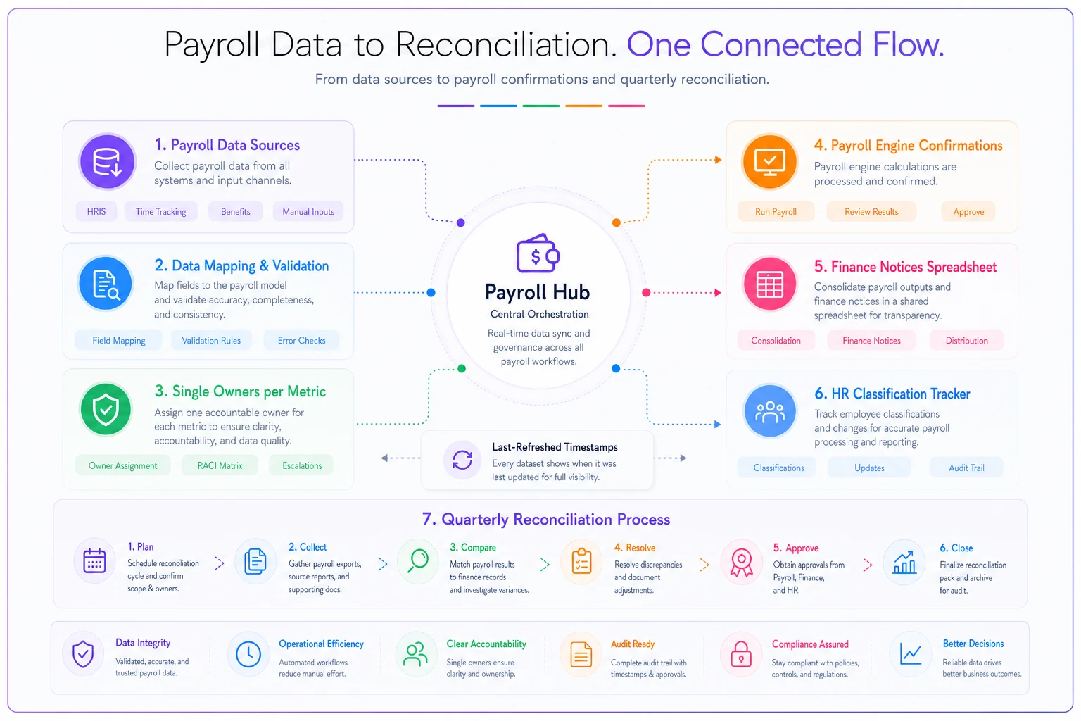
The diagram shows how source systems, ownership, timestamps, and reconciliation steps feed the executive one-pager.
A real scenario: when green hid a $40k problem
A mid-market logistics company, roughly 900 employees across several states, ran a payroll dashboard that had been green for months. Leadership was comfortable. Payroll processed on time, deposits were "compliant," everyone moved on.
The problem: their dashboard tracked whether deposits were made, not whether they were made to every jurisdiction they'd become liable in. They'd added drivers in two new states over the year without registering payroll accounts there. The dashboard had no "jurisdictions out of registration" line, so the gap was invisible.
By the time a state notice arrived, they were looking at back deposits, penalties, and interest somewhere in the $35k–$45k range once the response cycle was done — plus the internal hours to sort it out. The dollar cost stung, but the more expensive lesson was that their board had been shown green for two quarters on a metric that literally couldn't detect the failure.
After that, they added the registration line, wired the threshold to trip amber the moment a new work state appeared in the HRIS without a matching registration record, and gave it a named owner in compliance. The dashboard didn't get prettier. It got honest. The next time headcount expanded into a new state, the amber tripped before the first payroll ran there.
The takeaway isn't "add more metrics." It's that a dashboard can only surface risks it was designed to see — and boards can't act on exposures the page doesn't show.
When a one-page executive dashboard makes sense — and when it doesn't
This approach fits well once payroll spans multiple jurisdictions, multiple systems, or enough headcount that no single person can hold the whole picture in their head. Around the point where you've got a real board or audit committee asking payroll questions, a structured one-pager stops being nice-to-have.
It's a bad idea in a few situations. If your underlying data definitions aren't stable, a slick dashboard just launders bad data into confident color-coding — fix the canonical data first. If you're a small team where the payroll owner already briefs leadership directly and accurately, a formal dashboard can add ceremony without adding insight. And if leadership is going to treat green as permission to stop asking questions, a dashboard can actually reduce oversight rather than increase it.
Who should not build this yet: teams that don't have a single system of record per metric. You'll spend more time reconciling the dashboard than acting on it, and every meeting turns into "which number is right?" Sort the source-of-truth question first, then build the page on top.
Keeping it alive after the first board meeting
The dashboards that survive share one habit: someone reviews the thresholds on a schedule, not just the numbers. Business changes. A green threshold set at 200 employees may be dangerously loose at 900. New jurisdictions, new pay types, new benefit deductions — each one can create a risk the current page can't see, exactly like the registration gap above.
A light quarterly review works well enough: walk the nine metrics, ask whether anything changed that makes a threshold wrong, or whether there's now a tenth metric worth adding. Retire anything the board never reacts to. A metric nobody has ever acted on is taking up space that a real exposure could use.
The goal was never a comprehensive dashboard. It was a page a board reads, believes, and acts on — where green means safe, amber means look here, and red means someone's already moving. Get those three states honest and mapped to real consequences, and payroll stops being the function boards assume is handled right up until the notice arrives.
Ready to simplify your payroll operations?
Join 2,000+ businesses using Payexly to reduce payroll overhead, ensure compliance, and enhance employee satisfaction.