
Payroll reporting feels simple until you're sitting in a room with the CFO, CHRO, and department heads all asking for completely different views of the same data. The CFO wants accruals and liability trends. HR needs headcount movements and compensation bands. Executives want labor cost ratios against revenue. Everyone speaks a different language, but they're all pulling from the same payroll source system that wasn't designed for any of their specific needs.
What usually happens is payroll runs its standard reports, exports them to Excel, then three different teams spend hours reformatting the same data for their audiences. Finance adds journal entry codes. HR strips out confidential comp data. Someone manually calculates overtime percentages. By the time reports reach executives, the data is two weeks old and nobody can trace back to the source if questions come up.
The real challenge isn't creating reports — it's building a payroll reporting design that serves multiple stakeholders without creating a maintenance nightmare. Without a proper taxonomy and clear data contracts between teams, payroll reporting becomes a bottleneck that gets worse as the organization grows.
The taxonomy problem nobody really solves
Most payroll systems organize data for compliance and processing, not reporting. Your ADP or Paychex setup has earnings codes like REG, OT, and PTO. Finance needs those mapped to GL accounts like 5100-Salaries or 5200-Benefits. HR wants them grouped by department and job family. Operations needs them split by project or location.
A basic payroll reporting taxonomy needs to handle:
-
Raw payroll fields (exactly as they exist in source systems)
-
Normalized business entities (standardized definitions everyone agrees on)
-
Consumer-specific transformations (how each team needs to see the data)
This structure prevents the common mistake of building reports directly from raw payroll data, which breaks the moment earning codes change or new pay types get added.
Field-level source mapping: the unglamorous foundation
Mapping payroll fields to reporting requirements sounds straightforward until you actually try it. A mid-size company with 200 employees might have 30+ earning codes, 15+ deduction types, and dozens of department codes. Each needs explicit mapping to multiple downstream reporting categories.
Eliminate payroll errors and delays.
Payexly streamlines every payroll cycle ensuring accuracy and compliance.
- Automated payroll processing
- Real-time tax compliance
- Benefits & deductions management
No credit card required
Here's a real example from a 150-person professional services firm. Their payroll system had these earning codes:
``
REG - Regular Hours
OT - Overtime
DT - Double Time
VAC - Vacation
SICK - Sick Leave
PERS - Personal Time
HOL - Holiday
COMM - Commission
BON - Bonus
CELL - Cell Phone Allowance
MILE - Mileage Reimbursement
``
-
Finance needed these mapped to four GL categories
-
Base Compensation (REG, VAC, SICK, PERS, HOL)
-
Premium Pay (OT, DT)
-
Variable Comp (COMM, BON)
-
Reimbursements (CELL, MILE)
-
HR wanted completely different groupings
-
Productive Hours (REG, OT, DT)
-
PTO Usage (VAC, SICK, PERS)
-
Fixed Comp (REG, OT, DT, VAC, SICK, PERS, HOL)
-
Variable/Incentive (COMM, BON)
-
Benefits/Perks (CELL, MILE)
Without documented mappings, every report becomes a guessing game. Someone changes a formula in Excel and suddenly vacation pay disappears from the labor cost calculation.
The mapping document needs to capture:
-
Source field name and system
-
Business definition
-
Valid values/ranges
-
Transformation rules
-
Update frequency
-
Owner/contact
This becomes your source of truth when discrepancies come up — and they will, usually at month-end when everyone's already stressed.
SLA contracts that actually work
SLAs for payroll reporting usually fail because they focus on delivery timing instead of data quality and usability. "Reports delivered by noon on Monday" means nothing if the data is wrong or formatted incorrectly.
Data freshness commitments set expectations around when each data type is available. Payroll register data should land T+1 after processing. Tax withholding summaries need T+2 after period close. Benefits enrollment changes should run either real-time or in a daily batch. Time and attendance feeds typically work well with a daily 6 AM cutoff.
Quality guarantees define what "correct" actually means. Reconciliation to source should be a 100% match to the payroll register. Any period-over-period variance above 5% needs a documented explanation. And there have to be explicit rules for how nulls, zeros, and blanks get handled — not just left for whoever's building the report to decide.
Format specifications cover the practical stuff that trips people up: file types and naming conventions, column order and headers, date and number formats, delivery method (email, shared drive, API). This sounds tedious, but it's where a lot of downstream pain originates.
The part most companies miss: different stakeholders need different SLAs. The CFO preparing board materials needs data by the 3rd business day with full reconciliation. Department managers doing weekly labor reviews can work with preliminary data that's 95% complete.
Instead of one-size-fits-all SLAs, create stakeholder-specific contracts:
| Stakeholder | Data Set | Timing | Accuracy Required | Format |
|---|---|---|---|---|
| CFO | P&L Labor Detail | BD+3 | 100% reconciled | Excel with variance analysis |
| Controller | Journal Entries | BD+1 | 100% balanced | CSV import format |
| HR Director | Comp Analysis | BD+5 | Final, audited | Interactive dashboard |
| Dept Managers | Weekly Labor | Monday AM | 95% complete | Email summary |
| Executives | KPI Dashboard | BD+4 | Directionally correct | Visual dashboard |
Match the SLA to how each stakeholder actually uses the data. Executives making strategic decisions need different guarantees than accountants booking journal entries.
Dashboard wireframes that prevent scope creep
Every payroll dashboard project starts the same way: someone sketches a simple KPI view, stakeholders love it, then feature requests pile on until you're building a full analytics platform. The original goal gets buried under "nice-to-have" features.
Executive Dashboard Wireframe
Top row: Four big numbers that matter.
-
Total Labor Cost vs Budget (month and YTD)
-
Headcount Actual vs Plan
-
Labor as % of Revenue
-
Overtime as % of Regular Pay
Middle section: Trend lines, no more than three.
-
12-month labor cost trend with budget line
-
Headcount changes by department
-
Overtime hours trend
Bottom: Exceptions only.
-
Departments over budget by more than 5%
-
New hires this period
-
Terminations this period
That's it. No drill-downs, no filters, no interactive features. Executives get a one-page PDF every Monday morning.
Finance Dashboard Wireframe
Three distinct views:
Accrual Management — PTO liability by employee, vacation accrual vs usage trend, projected year-end liability, and employees approaching max accrual.
GL Reconciliation — Payroll register total, breakdown by GL account, variance from prior period, and unallocated amounts.
Budget vs Actual — Department-level grid, variance explanations, projected full-year figures, and approval workflow status.
Finance needs data integrity above everything else. Every number must tie back to source documents, which means building in reconciliation checks at every level — not just clean visualizations.
HR Analytics Wireframe
Compensation View — Salary bands vs actual by role, compa-ratios by department, merit increase impact modeling, geographic pay differentials.
Workforce Planning — Turnover by department and tenure, time-to-fill metrics, headcount pipeline, skills gap analysis.
Compliance Monitoring — Overtime threshold alerts, FLSA classification audit, pay equity indicators, benefits eligibility tracking.
HR dashboards need more sensitivity controls than the others. Not everyone should see individual compensation data, but aggregated views are essential for real decision-making.
KPIs that matter vs metrics that distract
Companies love tracking payroll metrics, but most measure activities instead of outcomes. Processing time, error rates, and query volumes tell you how busy the payroll team is — not whether payroll reporting is actually serving the business.
Report adoption rate — Are stakeholders actually using the reports, or still requesting ad-hoc pulls? Track unique viewers and repeat usage. If department heads aren't opening their labor reports, the format or timing is wrong.
Decision latency — How long between data availability and management action? If it takes two weeks to identify and address overtime issues, monthly reporting is too slow.
Reconciliation breaks — Not just the count, but the dollar impact and time to resolve. A few small breaks are normal; systemic ones point to mapping problems.
Self-service percentage — What portion of payroll data requests can stakeholders handle themselves versus requiring payroll team involvement? This is the metric that actually tells you whether your reporting design is working.
One professional services firm tracked "report delivery timeliness" at 98% for months and felt good about their SLA compliance. Then they discovered managers were spending 3+ hours per week reformatting those "timely" reports into usable formats. The real KPI should have been "time from data to decision," which was running 4-5 days. Nobody had thought to measure that until the complaints started stacking up.
The integration reality check
Building this taxonomy and reporting structure sounds great until you face the actual integration reality. Most companies run payroll on one system, time tracking on another, benefits somewhere else, and try to stitch it together in Excel.
Data typically moves through the pipeline in a defined sequence:
-
Time systems push to payroll — daily or per-pay-period
-
Payroll syncs to HRIS — after each run
-
Payroll feeds finance — journal entries
-
All systems consolidate into a reporting database or tool
The weak links become obvious fast. Time data might be days old by the time payroll processes. HRIS updates lag payroll changes. Finance needs data in a specific format that payroll can't produce directly. None of this is unusual — it's just the reality of working across multiple vendor systems that weren't designed to talk to each other cleanly.
This is where governance frameworks become critical — someone needs to own each integration point and ensure data quality throughout the pipeline, not just at the final delivery stage.
A simple visual of this flow clarifies integration responsibilities.
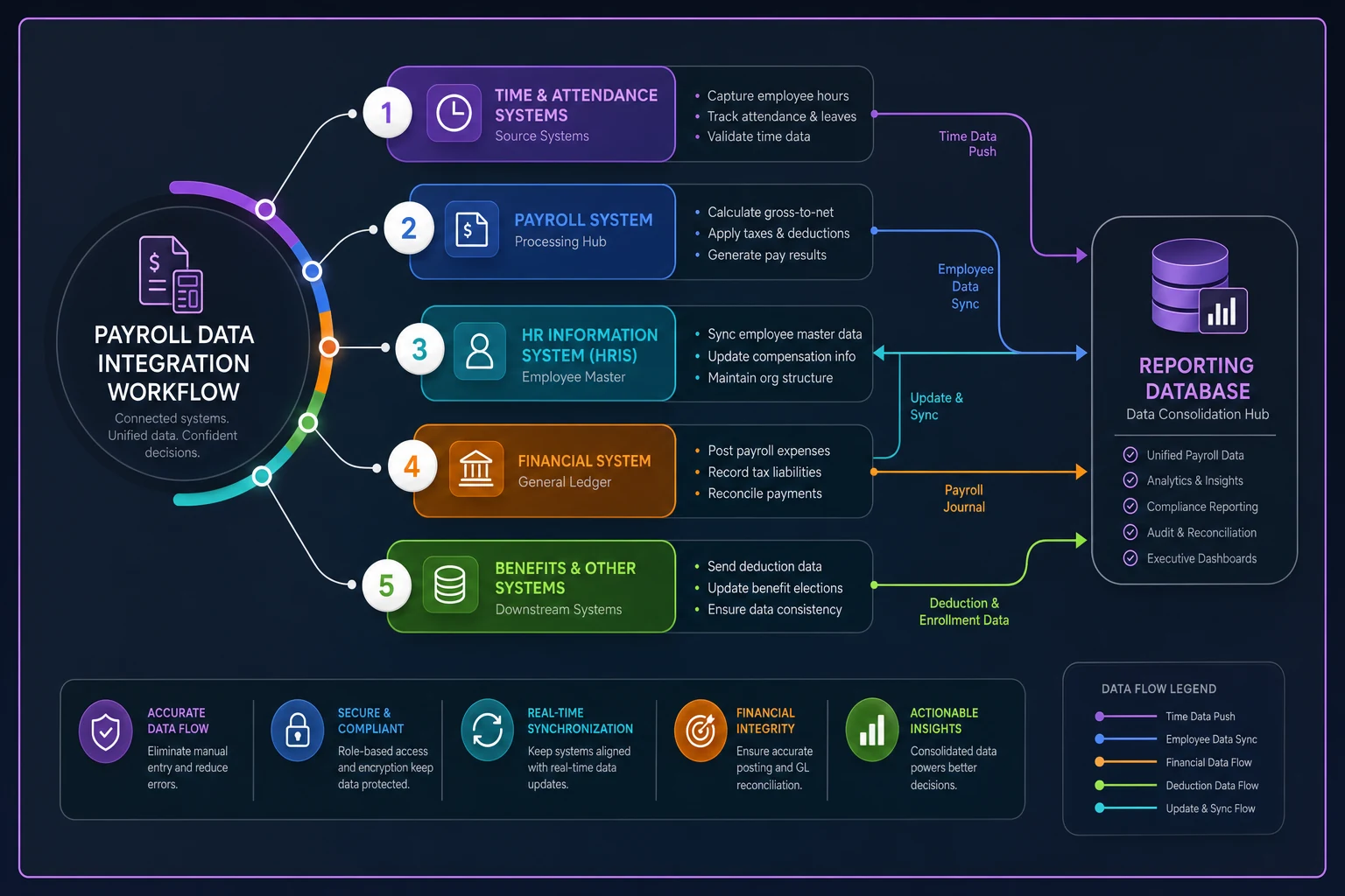
The integration weaknesses are often organizational as much as technical — assign owners and SLAs for each handoff.
Common failure patterns in payroll reporting design
The Excel evolution trap starts with a simple spreadsheet, grows with macros and pivot tables, becomes mission-critical, then breaks when the original creator leaves. One healthcare company had 47 different Excel files pulling from their payroll export, each with slight variations in calculations. Nobody knew which version was authoritative.
Department code chaos hits when organizations restructure but payroll codes don't update consistently. Suddenly you can't compare this year to last year because "Marketing" is now three different departments with different codes. Historical reporting becomes unreliable, and nobody wants to take ownership of fixing it.
The retroactive adjustment nightmare surfaces when payroll corrections and true-ups throw off historical reporting. Without clear rules for handling retro pay, every historical report becomes questionable. This connects directly to having solid validation processes before payroll runs — catching issues upstream is a lot cheaper than explaining anomalies downstream.
Stakeholder scope creep follows a familiar pattern: the CFO sees the HR dashboard and wants those metrics too. HR wants the finance reconciliation details. Eventually everyone has access to everything, which means no one has exactly what they need.
Security through obscurity is probably the most dangerous failure mode. Instead of proper access controls, companies rely on people not knowing reports exist. Then someone forwards the wrong dashboard to the wrong distribution list and suddenly individual salaries are visible company-wide.
Building consensus without endless committees
The hardest part of implementing a payroll reporting taxonomy isn't technical — it's getting stakeholders to agree on definitions and priorities. Every department thinks their needs are most critical.
Start with the highest-impact, least-controversial metrics. Total headcount seems simple, but even this sparks debates: Do you include contractors? Count FTEs or individuals? Use the last day of the period or anyone who worked during it? Include people on leave? These aren't small questions — different answers produce meaningfully different numbers.
Start with the highest-impact, least-controversial metrics like total headcount.
-
Data Owner
Makes decisions about definitions and access
-
Technical Owner
Maintains integrations and pipelines
-
Business Liaison
Translates between technical and business needs
-
Quality Reviewer
Validates data accuracy and completeness
These can't all be the payroll manager, though that's what usually happens by default. When one person is responsible for all four roles, none of them get done properly.
Automation opportunities hiding in plain sight
Once the taxonomy and mappings are documented, automation opportunities become obvious. Manual processes that seemed necessary are usually just workarounds for poor data structure.
Common automation wins include automatic GL coding (with proper earning code mapping, journal entries essentially generate themselves), rules-based variance explanations for common scenarios like new hires, terminations, and bonuses, compliance alerts when overtime exceeds thresholds or pay equity gaps emerge, and automated department summaries pushed to managers on a schedule rather than waiting for manual pulls.
The key is starting with clean, well-structured data. Automation built on shaky foundations fails fast and usually creates more cleanup work than it saves. AI-powered operational platforms can handle complex mapping rules and exception handling that previously required hours of manual review — and they improve over time as patterns get established. But they need solid data architecture underneath to be useful.
The real goal is eliminating repetitive data preparation so teams can focus on analysis and actual decisions. A payroll analyst spending most of their week formatting reports isn't in a position to identify trends or flag emerging issues before they become problems.
Measuring success beyond accuracy
Accuracy is table stakes. The real measures of success are business outcomes — things that are harder to track but matter more.
Signs of a working system: finance closes faster because payroll data arrives correctly formatted; HR can answer compensation questions immediately instead of "let me pull that data"; managers address overtime issues before they balloon; executive questions get answered in minutes, not days; ad-hoc report requests drop significantly.
One manufacturing company measured success in a simple way: their monthly finance-payroll reconciliation meetings went from 3 hours to 30 minutes. That's roughly 30 hours per year freed up for actual analysis instead of hunting discrepancies. Small number in the grand scheme, but meaningful to the people who used to sit in those meetings.
Another signal worth watching is turnover in the payroll team itself. When reporting is well-structured and the repetitive work is automated, the job becomes more strategic. People stay longer and contribute more. That's not a coincidence.
The path forward
Building a stakeholder-driven payroll reporting taxonomy isn't a project with a clean end date. Business needs evolve, regulations change, and systems get replaced. The taxonomy needs to flex without breaking.
Start small but think systematically. Pick one stakeholder group and nail their requirements completely before expanding. Finance is usually the best starting point because their needs are most structured and compliance-driven — there's less ambiguity about what "correct" looks like.
Document everything, including decisions that seem obvious now. Six months later when someone questions why overtime is categorized a certain way, you'll need that paper trail.
And don't let perfect get in the way of useful. A basic taxonomy that's consistently applied beats a complex system nobody fully understands. The goal is making payroll data useful for decisions — not building the ultimate reporting platform.
Your payroll data tells a real story about your organization: how you invest in people, where inefficiencies are hiding, and whether your labor model is sustainable. A well-designed reporting taxonomy makes sure everyone's reading from the same book, even if they're focused on different chapters.
Building a stakeholder-driven payroll reporting taxonomy isn't a project with a clean end date. Business needs evolve, regulations change, and systems get replaced. The taxonomy needs to flex without breaking.
Start small but think systematically. Pick one stakeholder group and nail their requirements completely before expanding. Finance is usually the best starting point because their needs are most structured and compliance-driven — there's less ambiguity about what "correct" looks like.
Document everything, including decisions that seem obvious now. Six months later when someone questions why overtime is categorized a certain way, you'll need that paper trail.
And don't let perfect get in the way of useful. A basic taxonomy that's consistently applied beats a complex system nobody fully understands. The goal is making payroll data useful for decisions — not building the ultimate reporting platform.
Ready to simplify your payroll operations?
Join 2,000+ businesses using Payexly to reduce payroll overhead, ensure compliance, and enhance employee satisfaction.