

Most payroll teams don't have a metrics problem. They have a trust and ownership problem dressed up as a metrics problem.
Why payroll metrics rarely drive real decisions
Walk into any mid-market HR or finance function and you'll find dashboards everywhere. There's the exec deck with cost-per-employee trends. There's a spreadsheet the payroll manager updates every cycle. There's a Power BI report someone built two years ago that half the team quietly ignores because the numbers "look off." And when a real decision needs making — should we renegotiate the vendor contract, do we have an overtime problem in the warehouse, is off-cycle spend getting out of hand — everybody goes back to pulling raw exports and arguing about whose number is right.
That's the failure. Not a lack of KPIs. A lack of decision-ready KPIs — numbers that a stakeholder trusts enough to act on without re-verifying.
A payroll KPIs operating model fixes this by treating each metric like a product with a contract behind it: someone owns it, it refreshes on a known cadence, it comes from an agreed source, and it lands in front of the person who actually makes the decision in a format they can read in ten seconds. This post walks through how to build that — KPI contracts, stakeholder-specific dashboard wireframes, and a 90-day plan that gates adoption on data quality instead of hoping people just start using the dashboards.
The real reason payroll KPIs get ignored
There's a pattern that repeats across almost every organization that "has metrics but doesn't use them."
Eliminate payroll errors and delays.
Payexly streamlines every payroll cycle ensuring accuracy and compliance.
- Automated payroll processing
- Real-time tax compliance
- Benefits & deductions management
No credit card required
-
Who owns this number when it's wrong?
-
When was it last refreshed, and how often does it refresh?
-
Where did it actually come from — which system, which field, which filter?
When those three answers are fuzzy, the metric becomes advisory at best. A CFO isn't going to freeze off-cycle payments based on a chart when nobody can tell her whether "off-cycle" includes bonus runs or manual checks or both. So she asks payroll to "double-check," payroll pulls the raw data, and the dashboard becomes a decoration.
The other quiet killer is definitional drift. Take something as simple as "payroll cost per employee." Finance wants it fully loaded — employer taxes, benefits, the works. HR wants base wages only, because they're benchmarking comp. Ops wants it by department with contractors excluded. Same label, three different numbers, and now every meeting starts with fifteen minutes of "wait, which cost per employee are we looking at?"
That's really a downstream symptom of source-of-truth problems. If your underlying data isn't consolidated, no dashboard on top of it will be trustworthy. That's why a canonical payroll data strategy has to come before the metrics conversation, not after — you can't contract a KPI to a source that doesn't have a stable definition underneath it.
KPI contracts: making every metric accountable
A KPI contract is a short, boring, incredibly useful document. One per metric. It removes ambiguity by forcing you to name the owner, the cadence, and the source — plus a definition precise enough that two people would calculate the same number independently.
The contract isn't bureaucracy for its own sake. It's what turns "here's a chart" into "here's a number I'll stake a decision on."
-
Metric name and plain-language definition (what it measures, in one sentence)
-
Exact formula (numerator, denominator, inclusions, exclusions)
-
Owner (the named person accountable for the number being right — not a team, a person)
-
Source system and field-level lineage (where each input comes from)
-
Refresh cadence (per pay cycle, weekly, monthly)
-
Freshness SLA (how stale is too stale before the number is flagged)
-
Thresholds (what's normal, what's a warning, what's an alert)
-
Consumer (which stakeholder and which decision this feeds)
Here's what a handful of real contracts might look like laid out together:
| KPI | Definition | Owner | Cadence | Source | Feeds decision |
|---|---|---|---|---|---|
| Off-cycle payment rate | Off-cycle payments ÷ total payments, excluding scheduled bonus runs | Payroll Manager | Per pay cycle | Payroll engine, run-type field | Process control / error trend |
| Payroll cost per FTE (loaded) | Gross wages + employer taxes + benefits ÷ FTE count | FP&A Analyst | Monthly | GL + HRIS headcount | Budget vs. actual |
| Time-to-correction | Hours from error logged to corrected pay issued | Payroll Ops Lead | Per incident, rolled weekly | Case/ticket system | Team capacity & SLA |
| Retro pay volume | Count + dollar value of retroactive adjustments | Payroll Manager | Per cycle | Payroll adjustments table | Upstream data quality |
| Tax deposit on-time rate | On-time deposits ÷ total deposits due | Payroll Tax Specialist | Per deposit event | Tax filing system | Compliance risk |
Notice the owners are different people. That's intentional. The single biggest mistake teams make is assigning every payroll metric to "the payroll manager." When one person owns thirty numbers, they effectively own none — you can't hold a single overloaded person accountable for accuracy across the whole board. Distribute ownership to where the knowledge actually lives.
Assign ownership to the person with the best domain knowledge for that metric, not the person with the broadest title.
One more thing worth flagging: the source has to be a system, not a person's spreadsheet. If the "source" for a KPI is a workbook a specific analyst maintains, you don't have a contract, you have a dependency. The day that analyst is on vacation, your metric is stale and nobody notices.
Dashboard wireframes that match how each stakeholder decides
The reason one shared dashboard rarely works is that HR, finance, and owners don't make the same decisions, so they shouldn't be staring at the same layout. A good wireframe is designed backward from the decision, not forward from the available data.
HR manager view — operational health
-
Off-cycle payment rate (with trend arrow vs. last 4 cycles)
-
Timecard exceptions outstanding
-
Time-to-correction, current vs. SLA
-
Retro pay volume this cycle
Second row goes to workforce signals: overtime hours by department, headcount reconciliation between HRIS and payroll, new-hire and termination processing lag. The HR view answers "is the operation under control, and where's the friction this week?"
Accountant / finance view — cost and compliance
-
Payroll cost per FTE (loaded), actual vs. budget
-
Total labor cost by cost center
-
Tax deposit on-time rate
-
GL-to-payroll reconciliation variance
Finance cares about accuracy against the ledger and exposure. The variance tile matters most — that's the number that tells them whether the books can be trusted, and it's the one that should trigger a same-day conversation when it moves.
Owner / executive view — three numbers, no clutter
-
Total labor cost as % of revenue (with direction)
-
Compliance status
green/amber/red on deposits and filings
-
One watch metric (usually whatever's currently a problem — off-cycle spend, overtime creep, a rising correction rate)
If you want to go deeper on structuring who consumes what and mapping every field back to its origin, the approach in designing a stakeholder-driven payroll reporting taxonomy pairs directly with these wireframes — the taxonomy defines the fields, the wireframes decide how each audience sees them.
The wireframe mistake almost everyone makes
Teams build the exec dashboard first because that's who's asking loudest. Wrong order. The exec view is a rollup of the operational views. If the HR and finance dashboards aren't trustworthy yet, the exec dashboard is just an aggregation of numbers nobody believes — except now it's in front of the person with the most power to make a bad call on it.
Build bottom-up. It's slower and less exciting, but it's the only order that actually works.
The 90-day adoption gate: earn trust before you scale
This is the part most rollouts skip, and it's why so many dashboards die within a quarter — they launch everything at once and hope people adopt it. Adoption isn't a launch event. It's earned by proving the data is clean enough to trust, one gate at a time.
The idea of a gate is simple: a metric doesn't get promoted to "decision-ready" and shown to executives until it passes a data-quality bar for a sustained period. Nothing goes on the owner's dashboard until it's survived weeks of scrutiny on the operational dashboards first.
-
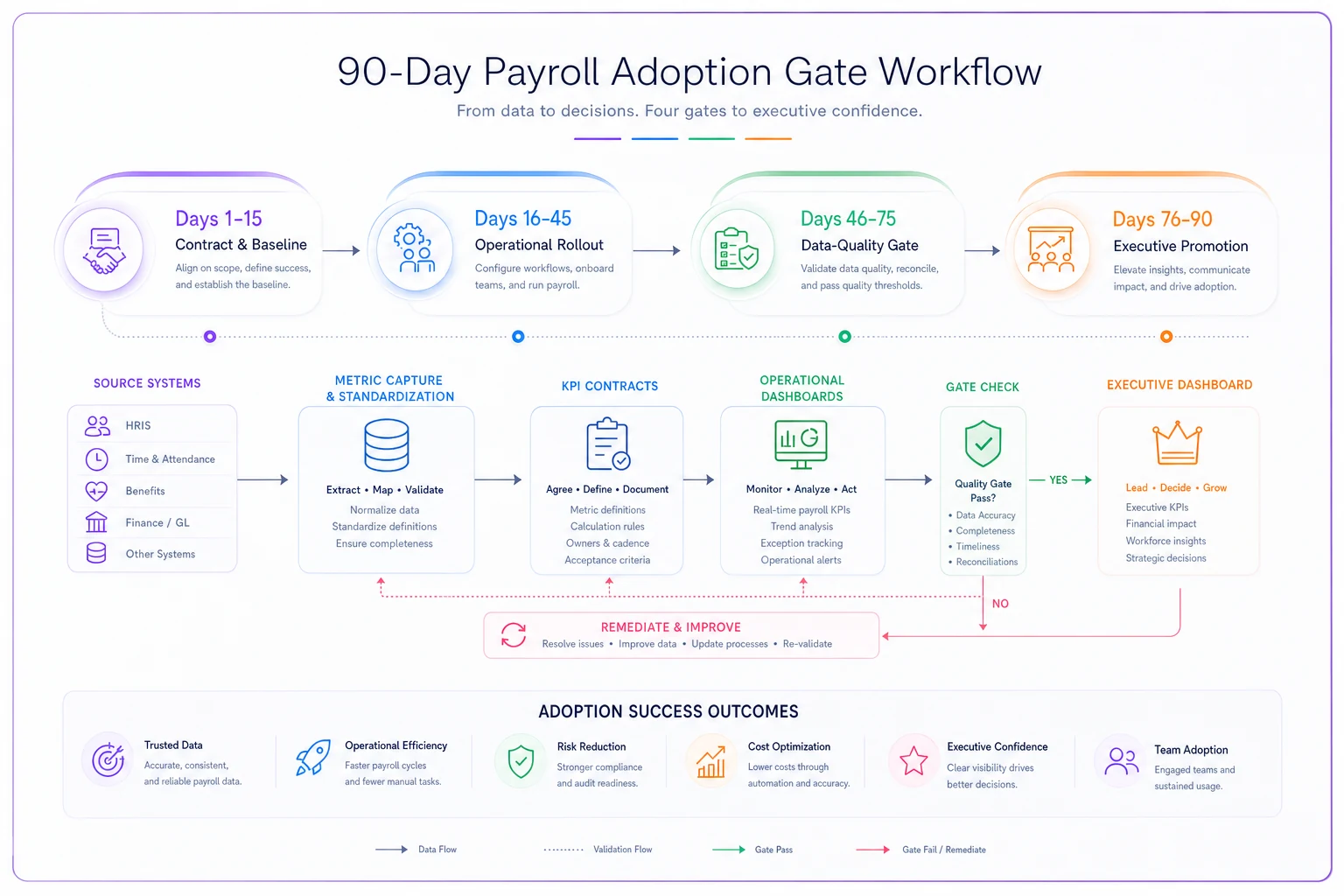
Days 1–15 — Contract and baseline. Write KPI contracts for your first 6–8 metrics. Don't boil the ocean. Pick the ones tied to decisions people already argue about. Establish a baseline: for each metric, measure how often the number matches an independent manual pull. If off-cycle rate matches a hand-count only 70% of the time, that's your starting data-quality score.
-
Days 16–45 — Operational-only rollout. Publish the HR and finance dashboards to their owners only. No exec visibility yet. Each metric owner reviews their numbers every cycle and logs discrepancies. The goal here isn't decisions — it's hunting for the reasons the number is wrong. Usually it's definitional (a filter mismatch) or a source problem (a field that's populated inconsistently upstream).
-
Days 46–75 — Data-quality gate. A metric passes the gate when it hits its accuracy target for two consecutive cycles — a common bar is 95%+ match to independent verification with a freshness SLA met every refresh. Metrics that pass get promoted. Metrics that fail stay in the operational sandbox and go back for source fixes. This is the whole point: you're gating on proven quality, not on the calendar.
-
Days 76–90 — Executive promotion and cadence lock. Only gated-and-passed metrics roll up to the owner dashboard. At the same time, you lock the review cadence — who looks at what, when, and what action each threshold triggers. A metric with no attached decision-and-owner gets cut, not displayed.
Here's a simple workflow to visualize the 90-day gate.
The discipline that makes this work is being willing to not show a metric. A dashboard with four numbers everyone trusts beats a dashboard with twenty numbers half the room second-guesses. Cutting metrics feels like losing, but every untrusted tile drags down confidence in the trustworthy ones sitting next to it.
A real scenario: a distribution company that finally trusted its numbers
A regional distribution business with around 240 employees — mix of hourly warehouse staff and salaried office roles — had the classic setup. Three versions of "labor cost," a payroll manager who owned every metric by default, and an exec team that ignored the dashboards entirely and just asked for a spreadsheet before every board meeting.
The specific pain point was off-cycle payments. They were running a lot of manual corrections, but nobody could quantify it because "off-cycle" wasn't defined consistently — some reports lumped bonus runs in, some didn't. Estimates ranged wildly depending on who you asked.
They ran a version of the 90-day plan. First move was a KPI contract for off-cycle rate that explicitly excluded scheduled bonus runs and assigned ownership to the payroll ops lead, not the manager. During the operational-only phase, the number came back at roughly 9–11% of payments being off-cycle — much higher than leadership had assumed, and most of it traced back to timecard corrections coming in after the cycle closed.
Because the metric was now trusted and owned, it actually drove a decision: they tightened the timecard cutoff and added an upstream validation step. Over the following couple of cycles, off-cycle rate dropped to around the 4–5% range. The dollar impact wasn't dramatic on its own — the bigger win was that falling correction volume meant the payroll team stopped burning a chunk of every cycle on rework. And for the first time, the exec off-cycle tile was a number the owner acted on instead of a chart he skipped past.
Nothing here was exotic. The metric already existed. What changed was giving it a contract, a real owner, and a gate to earn its place on the executive view.
When this operating model makes sense — and when it doesn't
When it's worth it:
-
You have multiple stakeholders arguing over "which number is right"
-
Payroll touches more than one system (HRIS, payroll engine, GL) so lineage genuinely matters
-
Someone's making cost or compliance decisions that need to hold up to scrutiny
-
You're heading toward more headcount, more jurisdictions, or an audit
When it's overkill:
-
A very small team where one person genuinely does own and know every number, and everyone trusts them — formal contracts add friction you don't need yet
-
You haven't consolidated your source data at all — contracts on top of chaos just document the chaos, fix the source first
Who should not start here:
If your payroll data still lives in disconnected exports and nobody agrees on a canonical headcount, don't build dashboards yet. You'll spend the whole 90 days fighting definitional fires. Get the data foundation stable, then layer this on top. The operating model amplifies a clean foundation and exposes a messy one.
Making it stick as you grow
The reason this holds up at scale — and where ad-hoc dashboards fall apart — is that everything traces back to a contract. When a new metric gets requested, you don't debate it in a meeting; you write a contract, assign an owner, run it through the gate. When a number looks wrong, you check the contract's source and owner. When you add a jurisdiction or a new pay type, you version the affected contracts instead of quietly breaking every downstream chart.
This is where operational software earns its keep, quietly. A platform that centralizes payroll data, tracks each metric's source and freshness automatically, and flags when a number goes stale removes the manual reconciliation that makes people distrust dashboards in the first place. AI-assisted checks can catch definitional drift and outlier movements before they land in front of an executive — surfacing "this number moved 30% and here's why" instead of leaving someone to notice the anomaly three meetings later.
But the tooling is secondary to the discipline. The contracts, the ownership, and the gate are what make payroll KPIs decision-ready. Get those three things right — owner, cadence, source — put the numbers in front of the people who actually decide, and gate everything on proven quality before it goes live. Do that, and payroll metrics stop being wallpaper and start changing decisions.
But the tooling is secondary to the discipline. The contracts, the ownership, and the gate are what make payroll KPIs decision-ready. Get those three things right — owner, cadence, source — put the numbers in front of the people who actually decide, and gate everything on proven quality before it goes live.
Do that, and payroll metrics stop being wallpaper and start changing decisions.
Ready to simplify your payroll operations?
Join 2,000+ businesses using Payexly to reduce payroll overhead, ensure compliance, and enhance employee satisfaction.